|
|
Location: GUIs >
Linux / Unix >
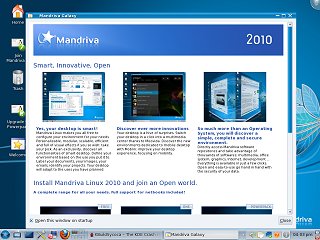
Mandriva 2010 (formerly Mandrake) with KDE 4.3.2 screen shots Linux user interfaces have come a long way over the years. It is 2010 now, the desktops, file managers, and application user interfaces are much more complete and robust than they once were. Unfortunately while reviewing Mandriva I ran in to quite a few more speed bumps and blemishes than I would expect. Originally this product was called "Mandrake Linux", but for various reasons they changed the name to "Mandriva Linux". Mandriva comes in KDE, Gnome, and XFCE versions. (Confusing before you even download it!) The KDE version is apparently the more popular, and what Mandrake used previously, so this is what I chose to review.
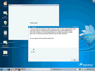
Mandriva boots from a "live CD" that can be used to install the OS or sample the OS without installing. The first time I tried to install, the installer completely refused to start with no hint as to what was wrong. It turned out it was confused because the drive was previously formatted for HaikuOS. After wiping the drive the installer started but gave an error saying "I can not read the partition table of device sda, it's too corrupted for me :(" Yes, the error message is in first person, and yes, that is a text frouny face at the end. Not very professional, and poorly worded. There were a few other problems I noticed that made the installer appear kind of shabby. Most "advanced" buttons displayed the advanced options in the same window, making it unclear if I could go back or cancel from the advanced selection. Also, it often displayed just a blank window while performing lengthy operations.
The default icons on the desktop are:
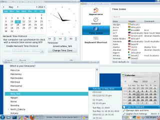
One of the first things I needed to do was reset my clock. The clock control panel appears during installation but can also be accessed from the right-click menu of the desktop clock. Setting the clock is very painful because it only uses a non-standard 24-hour format. Regular people do not use 24-hour time, so it doesn't make any sense to present this to the user. It is a matter of just adding and subtracting so why shouldn't this be done by the computer? Speaking of time, it is now 2010. Windows 2 from 1987 was capable of enabling users to set their time using either 12 or 24 hour time depending on their control panel setting. And the clock here is indeed set to normal 12 hour time. The Mandriva clock also insists on always adding an extraneous zero to the beginning of the hour. And, as if there weren't enough problems with this control panel, the time zone selection was a pain because it asked for a "city" from a huge list rather than just asking for Eastern/Cenral/Pacific time. It doesn't seem right selecting "New York" for Eastern time when I really live in a city nowhere near New York. Redundantly, there is another seemingly redundant time zone selection in a second separate control panel with some other clock settings. Clicking on the clock brings up a browsable calendar (not used to set time). Whatever that first column is on the calendar, it doesn't fit. One of the clock's right-click menu options is a "copy date to clipboard" option. An interesting feature, but where would this be useful?
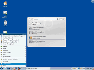
An interesting feature of the "Run Command" menu item from the Launcher, is that it produces a list of possible matches from the program groups as you type. (But it doesn't help if you forget the kommand you want starts with letter "K")
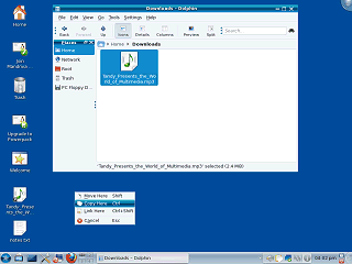
On the desktop, when you move the mouse over an icon it changes to look like a button. This gives the impression that it can be single-clicked on, but it can't. By default it must be double clicked, although single clicking can be enabled as an option. Files can be dragged and dropped between folders or the desktop. Instead of immediately dropping it, Mandriva displays a menu prompting which action should be taken. This is an extra step but eliminates any ambiguity in what the default drop action may be. While trying to get screen shots, it turns out that the "print screen" key can not be used while a menu is being displayed. Instead the screen capture utility must be started separately and set to take a timed screen shot. (Is this is a clever way to prevent users from sending in screen shots to the help desk where they say "well, I clicked this menu item and...")
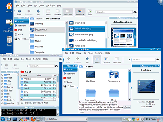
"Dolphin" can display files as regular icons, in columns (Like MacOS X), or as a detailed list. You can change the size of icons using a slider that usually appears in the lower right of the file windows. There are four optional "panes".
|

