|
|
Location: GUIs >
Linux / Unix >
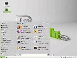
Mint Linux 13 MATE 1.2/Cinnamon 1.4 With MATE 1.2 and Cinnamon 1.4 Screen Shots Mint 13 is the Long Term Support release of Mint Linux. This means that people should be able to rely on the features and functionality over a number of years without worrying about change. While many Linux distributions have multiple "flavors" with different desktops, most choose one specific desktop for their official product. In the case of Mint 13, it appears they treat each of their desktops as equally "official" and therefore all covered by the same long term support. Specifically, Mint has added two new desktops: - The MATE desktop. MATE is a fork of the classic Gnome 2 desktop that
looks and feels basically the same as Mint 11.
MATE:
Not really much to see here. It looks and works just like Mint 11. This is very good news for those who are familiar with or need the flexibility of the classic Gnome 2 desktop.
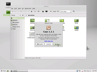
One difference from Mint 11 is that normal scroll bars are back.
Over all this has the same sensible and solid organization and configurability of the standard Gnome 2 desktop. Since this is a long term support release, there is no fear that this desktop is going to go away. I highly recommend Mint 13 with Mate. Cinnamon:
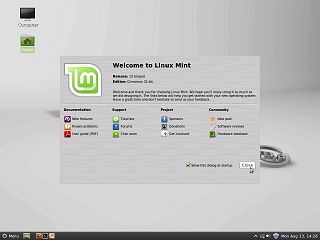
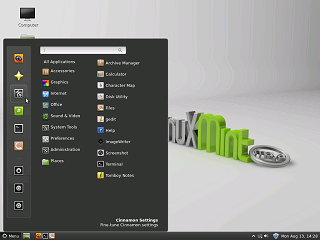
Much of Mint 13 is quite similar to Mint 12. Unlike Mint 12 there is no extra panel at the top. And the "Unity"-like full screen menu is nowhere to be seen.
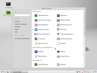
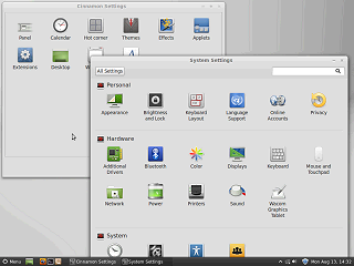
It still has two separate control panels, (as well as a control panel
program group) but they at least look visually similar.
|
