Location: GUIs >
Linux / Unix >
Ubuntu 11.04 Unity
<< Previous Page | 1 | 2 | 3 | Next Page >>

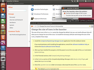
The Control Center replaces the GNOME desktop "System" menu, and is
launched from the "Power" menu in the upper right corner.
Disappointingly, the Launcher and the Top Bar really have no configurable
options.
I have to load additional software just to change the size of the icons?
Seriously?
(Meh, they should have marketed the extra software as the "Ubunutu Plus!
Pack")
  

Another odd change made to Ubuntu 11.4 is a new scroll bar.
This scroll bar is only present in Gnome/GTK applications that use the
built in scroll bar. As such the new scroll bar does not appear in Firefox,
OpenOffice, or even the new Unity desktop!
At first, it is not visually obvious how to use it. It appears it was
designed to reduce clutter, and sacrifices the visual elements necessary
to give users visual hints as to its function.
At first it appears as just a thin line on the edge of a list box, the
length indicating roughly what percentage of the list is displayed. A slider
control only becomes visible as the mouse cursor moves over the line. In
a slight inconstancy, the slider may appear on either side of the line
depending on if the window is at the edge of the screen or not.

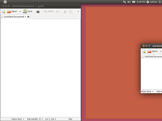
In an attempt to mimic Windows 7 (which itself is reviving a relic
from Windows 1), dragging a window to the edge of the screen causes it
to "tile". Dragging it to the top causes it to "maximize".

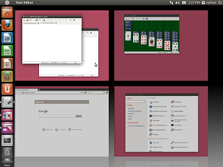
As is typical with Linux desktops, Unity has a Workspace switcher.
Application windows can reside on any of 4 different workspaces. Using
3d acceleration, the desktops zoom in and out when the selector is used.

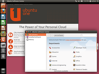
In addition to Firefox, LibreOffice Writer, Calc, Impress, Workspace
Switcher, Applications and Files and folders, the Launcher also contains
icons for the Ubuntu Software center and Ubuntu One.

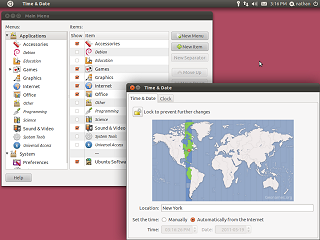
The Gnome menu control panel is still present even when Unity is active,
but this is because it still has both desktops currently.
On the brighter side, the Time Date control panel applet works much
better now.

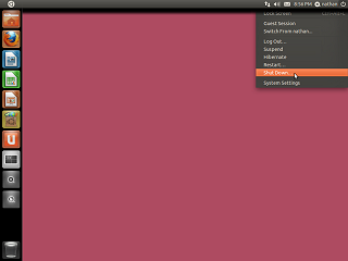
Getting ready to shut down Ubuntu 11.4.
In summary, I think the Unity desktop actually has some potential but
needs much improvement.
Some of the things that need to be changed:
-
Restore an application hierarchy similar to the Applications menu.
-
Use smaller icons, or adjust to the size available.
-
Don't cover the entire screen with the Dash.
-
Conform to the system color settings (this is not a video game!)
-
Don't show non-installed applications in the application menus. Keep installation
separate.
-
Add user customizability to the application hierarchy.
-
Add user customizability to the size and location of the launcher.
-
Add the ability to turn off capture of menus on the Top Bar, probably default
to off for normal desktop installs.
-
Fix LibreOffice to use the menus in the same ways as other applications.
-
Either don't require 3d acceleration or ship 3d capable drivers for all
video cards.
I would really rather see original, open, user interface research but it
feels like Ubuntu is just randomly copying MacOS X and Windows 7.

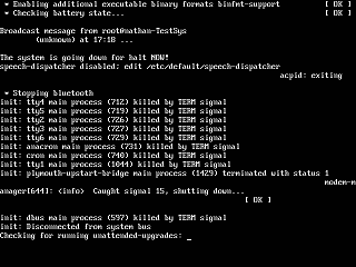
Ubuntu shutting down... Apparently it is very important that I know
that the dbus main process is killed by the TERM signal. Whatever the hell
that is.
<< Previous Page | 1 | 2 | 3 | Next Page >>
| 