|
|
Location: GUIs >
Linux / Unix >
Ubuntu 7.04 Screen Shots As of right now (September 2007) Ubuntu Linux appears to be the more popular of the Linux distributions out there. So I decided I had better check it out. Downloading it, it was nice to see it was a single CD image. Some Linux distributions try and package every crazy little thing they can on the installation disk, but Ubuntu appears to try and keep it simple.
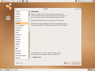
It is not even installed yet and it starts up to an almost fully functional desktop. Unlike a typical "Live CD" this doubles as the installer. One little problem, I happened to notice that if the display starts up at only 800*600 (which I guess it may do if it doesn't recognize the monitor or video card) then the installer application doesn't quite fit on the display.
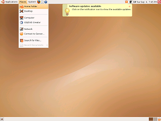
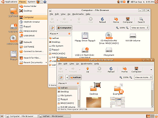
Like a number of other current Linux distributions, Ubuntu uses the GNOME desktop, with the Nautilus file manager, and the GNOME panels. Interestingly there are no desktop icons by default. It appears the intention is to access disks and drives using the "Places" menu.
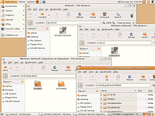
Ubuntu's file browser is configured to display with a full set of toolbars and and a side pane listing the drives on the system. The current location is represented by a series of buttons. You can toggle this using the button on the left to manually enter a folder location or a SMB, FTP, or SFTP URL. (HTTP urls are not accepted as this is not a web browser)
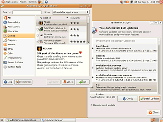
The Update Manager also provides updates in a fairly friendly manner, but at a whopping 180 megs of downloads I think it could use an option to sort by size. Also putting the individual updates in groups that could be selected/unslected as a group or individually could be beneficial - as it turns out the update hog is OpenOffice.
|
