Location: GUIs >
Windows >
Windows 8 Screen Shots (NT 6.2)

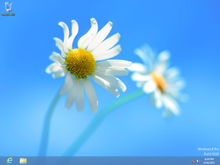
Clicking on the Desktop tile shows a Windows desktop. Freedom from Metro?
Not quite.
The most notable difference from a Windows 7 desktop is that there is
NO START MENU!
Microsoft also removed "Gadgets" from the desktop.
Oh, flowers! As if giving you flowers would make up for the total destruction
of your desktop.

Clicking in the lower left corner of the screen toggles you back to
the full screen Start Page.

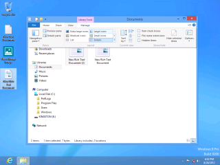
The Explorer "command bar" is changed around from Windows 7. Notice
how the ribbon interface is evolving back in to old fashion menus, just
with more clutter.
Since the normal bundled Windows applications are not included on the
main Start Page, it is impossible to easily find anything.
A couple of hints:
-
There are already several Start Menu replacement programs available at
http://www.stardock.com/products/start8/ and http://lee-soft.com/ (Remember
installing applications is not practical if the computer isn't yours)
-
It is possible to create a desktop shortcut to "C:\Users\[your user name]\AppData\Roaming\Microsoft\Windows\Start
Menu\Programs"
-
Start key + "R" opens the run dialog where you can type the name of a Windows
executable.
-
You can also browse to your Program Files folder to run programs directly,
create shortcuts to them, or pin them.
It's back to the Windows 3.1 way of doing things.

Launching certain kinds of files will switch you back to the Metro
interface.
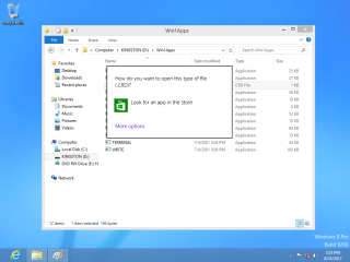
Certain message boxes and dialogs are also "metrofied". They have no
windowing controls and may cover the entire screen.
In this example, attempting to open an unknown file type displays this
dialog. It prominently advertises the Microsoft store, and there is no
visible option to cancel or dismiss. Even ALT+F4 fails to close it! The
trick on this one is you have to click OUTSIDE the dialog.

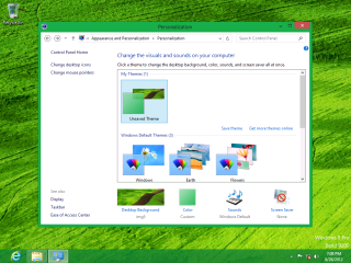
The Windows desktop is customizable separately from the Metro desktop.
This uses the desktop control panel, which is also separate from the
Metro control panel.

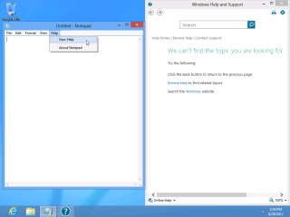
No connection to Microsoft's web site? No help for you!
And Microsoft gets to know every help request you make!
A Tutorial for all this stuff would have been nice.

In Windows 7, we already had three distinctly different application
user interfaces styles.
-
The classic application with a drop down menu
-
Ribbonized applications
-
Webby applications
With Windows 8's Metro, that brings the count up to 4!
Thanks so much for simplifying everything!

From the desktop side, the only other thing of any real notability
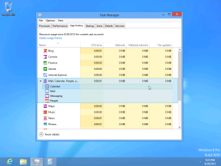
is that they re-did the task manager.
By default it shows only a simple iconic list of running applicatons,
kind of like the task manager in Windows 9x.
Showing more detail shows the same information as previous, plus some
"app" related details.
| 