|
|
Location: GUIs >
Linux / Unix >
Linspire Five-O Screen Shots The local Microcenter was selling machines with Linspire as well as Linspire CDs so I decided to pick up a CD and give it a kick around. "Linux" is no longer just an experimental operating system for bored programmers to hack on, where incomplete and non-robust designs and implementations are acceptable and often the norm. Many Linux distributions are now real desktop operating systems that can compete squarely with Windows and MacOS. Although I think there are still a few wrinkles that need to be ironed out. My first step in testing Linspire was to install it. While I didn't get any screen shots of the installation, it was very straightforward. I just booted from the CD and installed it on a blank hard drive. It was mostly just clicking "next", "next", "next" and then it chugged away for a while until it was finished. The only thing I didn't like about the setup was that during the first boot part of the setup it displays the date/time settings using "24 hour" time. In this country anyway 24 hour time is very seldom used. (So, what time is it when your clock says 13 o'clock? Why, time to get a new one!)
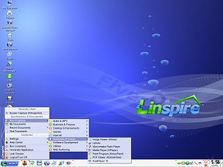
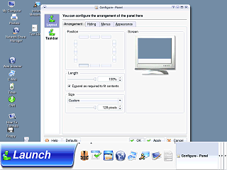
Linspire uses the KDE 3.3.2 desktop and is configured to look and feel similar to Microsoft Windows. The "K Menu", as it is called (although it is branded with the Linspire "L" and the word "Launch") contains the general assortment of options a Windows user would expect. This menu uses a more space conservative approach over that of Windows XP and places recently use applications at the top of the menu. (Although that places the application icons further from the button) To the right of that are application and menu buttons that launch the help center, File manager, web browser, e-mail, and an instant messenger. The final icon is a desktop show/hide button. Next to that is the panel task bar where buttons for active applications are displayed. At the end is the Panel system tray that displays icons for various resident applications.
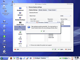
When I made my selection to my surprise it wanted me to restart. Well, it wanted a "Quick" restart but that still terminates all running application. I am very surprised and disappointed that a modern operating system would need this. My Windows 95 can happily change resolutions, color depths, and refresh rates on the fly with hardly a hiccup. (Yes, I just compared a 2006 Linux to Windows 95, deal with it).
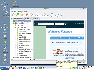
This is Linspire's software distribution tool, but it requires a fee to access. They have a huge library of software specifically prepared for Linspire, so there is no hassle fiddling with the system to get it to work. The Launch/K menu is full of icons for programs that are not actually installed on the system but instead launch CNR so you can install it if you are signed up. I am impressed by their business model, they can make some real money this way. I never could find the updates it was talking about if there were any. And since I was just kicking it around I chose not to sign up (I didn't feel like giving my credit card number out to just anybody again) so I just hid the update icon. The panel system tray also includes icons for SurfSafe, a web filtering
service, and VirusSafe, a virus scanner, both of which are also subscription
services.
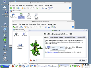
There are no actual drives in the My Computer folder, those are placed on the desktop instead. The "My Desktop" icon provides a redundant folder view of the contents of the desktop. "My Documents" is, of course, the location where users should create and store their documents. But here it is in the "My Computer" folder rather than directly on the desktop where it would be more visible and accessible to the user. The "Network Shares" folder contains any connected network folders. (More on that later). The "Storage Device" opens the Linux file system. Confusingly the same set of icons appear if you navigate to your "home" folder, although there are no direct paths to the "home" folder here suggesting the user is not to use that directly in Linspire. (Similar to how your profile folder is handled in Windows)
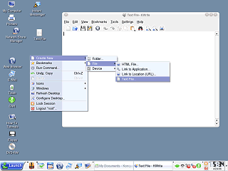
The Linspire desktop has a "Create new" option (with a seemingly unnecessary "file" sub menu) but none of the installed applications appear to take advantage of this. The "Device" sub menu provides a way to manually create disk icons for drives in the event the OS has somehow failed to do this automatically. This is something a typical user should never touch, would have no clue how to set up, and should not be included in this menu. However this is apparently needed because the disk drive icons are completely deleteable, something else the user should not be able to do. |
