|
|
Location: GUIs >
Linux / Unix >
Mint Linux 12 Gnome 3 With Gnome 3 Screen Shots
Just as people were switching to Mint Linux to avoid the Gnome 3/Unity mess, support reasons have forced Mint 12 to switch to Gnome 3. Once again, Mint Linux 12 attempts to be familiar and friendly but Mint is now forced to fight an uphill battle against Gnome 3 and the Gnome 3 shell desktop.
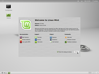
Disappointingly, even though it got it right in Mint 11, the clock defaults to the wrong settings. Even though it knew the time zone location was in the USA it incorrectly set the clock to bizarro 24-hour time.
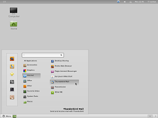
Unlike Mint 11, Mint 12 now has an extra panel bar at the top which contains system items. The start menu no longer shows "favorite" applications, but instead simply shows a list of all applications grouped by standard categories. The "Places" and "Locations" are merged in to a single column of small icons to save space. Unfortunately the choice of icons is rather poor. The Firefox icon is not the standard one, and although a seashell is the logo for the Nautilus file manager, it fails to communicate its function. A scroll bar appears on the longer application groups, but it can not be dragged like a normal scroll bar. Unlike Minx 11 there appears to be absolutely no customizability of the task bar / panels. Right-clicking on them doesn't even do anything. Seriously, WTF? I also couldn't help but notice that there is no keyboard accessibility on the desktop. This despite the fact most Linux lovers love their terminal and keyboards.
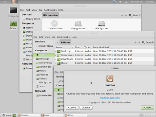
An oddity I noted in the Mint 12 window management is that some dialogs, like "about" dialogs, now use unmovable windows. This is presumably an attempt to appear more "MacOS" like. However this is actually a MacOS eccentricity dating back to the single-tasking days when nobody would ever possibly need to see the dialog and what is underneath it at the same time. You people had it right the fist time.
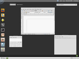
This looks a lot like Ubuntu's "Unity", but confusingly it is actually a completely different shell program and part of the Gnome Shell. Why anyone would willingly re-implement this kind of shell is beyond me. Unlike Ubuntu 11, at least it provides a menu listing the standard application groups. This way of selecting an application seems completely useless. To select any random application one would start by clicking in the upper left, then clicking "Applications", then navigating all the way to the right of the screen, click the desired group, and then select the application.
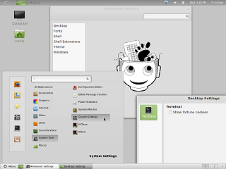
There are actually two of them. The first one is called "Advanced Settings" and is launched from the gear-like icon on the left of the start menu. Instead of a list of icons and applets, it uses a scrollable text selection list on the left with the settings appearing on the right. Despite the name, it contains a mix of common and advanced settings. It also starts off displaying a very out of place 2-bit graphic reminiscent of something drawn in monochrome MacPaint. If you look through the start menu for other settings, you might find the applet called "Desktop settings", unhelpfully located in the group called "Others" and think it might be... oh, I don't know, perhaps settings for the desktop? It only seems to have one setting and it has nothing to do with the desktop!
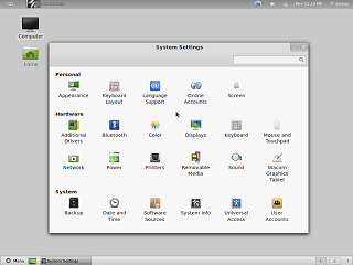
"System Settings" is the actual normal control panel. But it no longer contains all of the settings. They are spread out across this control panel, the "Advanced Settings", and the "Other" Mint start menu program group. |

