|
|
Location: GUIs >
Windows >
Windows 95 (revisited) screen shots With recent developments and popularity of phone and tablet computing, it seems as if the traditional file/folder desktop metaphor may wind up taking a back seat to dumbed down "appliance" like user interfaces. As such, I thought I should revisit Microsoft's OS that first brought the desktop metaphor of the Xerox Star / Apple Lisa to Windows. It is fair to say that Windows 95 was a significant leap forward in usability over Windows 3.1 and the primitive and cumbersome Program Manager shell. Windows 95 incorporated user interface advancements, visual styles, popular functionality, and a focus on usability popularized by other operating systems and shells of the day. Microsoft took the "best" pieces and pulled them together in a way that fairly well suited Windows.
It is interesting to follow the work on Windows 95 from the original "Chicago" development builds. The early builds were still mostly 16-bit and familiar Windows 3.1x bits stick out from underneath the new redecoration .
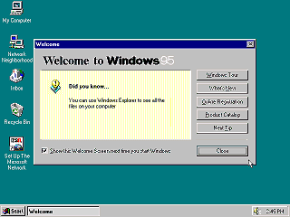
The first thing a Windows 3.1 user might notice is that, windowing controls, dialogs, input controls, and menus all now have a beveled "3d" appearance. This visual appearance was popularized by NeXTStep and OS/2 2.0. It is interesting to notice that the original retail "gold" release of Windows 95 did not include Microsoft Internet Explorer at all. The only prominent connectivity in this version is Microsoft's proprietary MSN dial-up service. The OEM version of Windows 95 "gold", however, included Microsoft Internet Explorer 1 (a rebranded version of Mosaic) as a non-optional component. The default icons on the Windows 95 "Gold" desktop are:
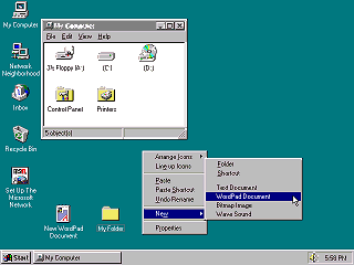
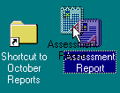
If you were using a computer in 1995 you were probably using it for creating and printing documents. (or playing Doom.) Unless you were a high-tech geek you probably had not had a computer for more than a couple of years, and were used to working with Real World documents and filing systems. In Windows 3.1 you would launch an application program, input information, and then save it to a file. In Windows 95 you create, open, and manage documents right in front of you. More like what you would do on a real desktop. The Xerox Star, Apple Macintosh, and numerous clones already proved that an icon-document oriented desktop interface worked well for this purpose. On the Windows 95 desktop:
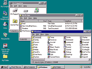
Similarly, Microsoft placed drive icons in the "My Computer" folder instead of the desktop. This better accommodates potentially large number of drives, partitions, and mapped network drives.
You can view folders as large icons, a list of small icons, or a detailed view. By default Windows hides file extensions and system files such as DLLs. This attempts to make it look like classic MacOS, which stores file type information in the file system instead of the name.
One notable thing lacking is a default place to put your documents. In Windows 95 you are supposed to create your own folders directly on the hard drive, as was done in previous versions. (The Windows 95 Tutorial specifically demonstrates this) This was back before OSes felt they needed to "own" the entire primary drive. Later versions of Windows added a "My Documents" folder. Combine the fact that there is no obvious "file" menu to create new folders with the fact that the only default thing you can put files in is the Recycle Bin - and you wind up with some strange ideas of where to store important documents!
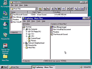
"Exploring" a folder, instead of just opening, displays a folder hierarchy tree on the left. These can be useful for advanced users when exploring deep hierarchies which would otherwise open many windows. The Exploring view better shows the new Namespace hierarchy. The idea is, all objects are part of a browsable hierarchy originating at the desktop. This includes the Control Panel, printers, dial up networking, Network Neighborhood, as well as the drives themselves.
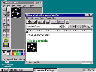
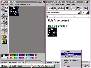
If you completely covered one application window with another you might think the first window was "gone". Nothing on the screen would indicate it is still there. Even if you knew it was still there, getting back to it could be difficult if there were many windows in the way. "Alt-tab" could help, but causal users did not find that obvious. The new "Task Bar" helps solve this problem. Like Windows 1.0 it reserves a space for active programs at the bottom of the screen. It displays a button for each application window even if it is not minimized. You only need to click a button once to bring the window to the foreground. Simply click to bring one application to the front, click to bring another to the front. As they joked back then, "so easy even a talk show host can do it".
The option to do this is not terribly obvious. You must right-click on an empty portion of the task bar to do this. Later versions of Windows add a "show desktop" button to the task bar.
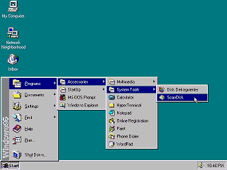
The Start menu provides instant access to the most common desktop functions. Why a single "Start" button? Well, they actually tried multiple buttons but users found a single button less confusing. Having a constant, immutable, set of options that is always immediately available to a user proved to be useful for support and documentation. It was easy to give instructions over the phone to Windows 95 users, such as "click Start, Settings, Control Panel, then click the Add New Hardware icon". Those items are always there. The programs menu was a little problematic. Let's say if you wanted
to play solitaire you would click Start, then Programs, then Accessories,
then Games, then Solitaire. If you closed the application and wanted to
re-open it, you would have to go through the same thing again.
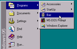
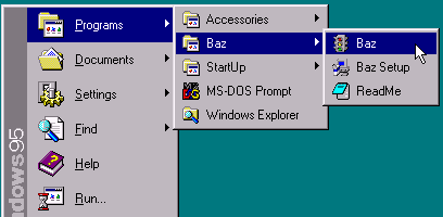
In practice most applications continued to make Windows 3.x style program groups. Worse yet, many newer applications create dozens of seldom used shortcuts, multiple groups, and extremely deep sub menus. On a fully loaded system the Programs menu can fill up and wrap around.
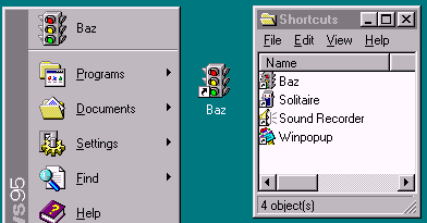
Again these locations should be reserved for the most commonly used, most important applications. But to the marketing department, their crazy application is ALWAYS the most important. |
