|
|
Location: GUIs >
Linux / Unix >
Ubuntu 10.04 with Gnome 2.30 screen shots. Canonical's Ubuntu 10.04 is yet another iteration of their Linux distribution, marketed as being friendly and easy to use. 10.04 is also a "Long Term Support" version for those who want bug fixes for the next couple of years without potentially introducing instability from new features. The Ubuntu desktop is indeed very well polished and thought out, and as Linux slowly becomes more accepted as a somewhat mainstream product this is more and more critical. However I did notice a few areas that could use a bit of improvement.
Like most Linux distributions, Ubuntu can be booted from a live CD where you can install to a hard drive or try it out without installing.
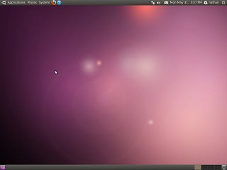
The initial desktop consists of two "Panels" on the screen. One at top and one at bottom. The top panel includes three menus that provide user access to the entirety of the system.
At the right of the top panel, it also includes:
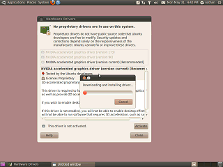
Ubuntu seems to recognize all of the hardware in this basic test system, but initially it only provides a 2-d driver for the video card. After connecting to the internet, Ubuntu wanted to download and install "restricted drivers". With Linux, most drivers are built in to the operating system and can not be added or updated directly by the end user. An exception has been made for Nvidia, who wish to keep control over driver distribution and source code to their video card driver. There are various technical advantages and disadvantages to this. The program makes a point of warning the user that bugs in these drivers can not be fixed by Ubuntu developers. From a users standpoint, built in drivers means you usually will not be able to make use of newly released hardware until the needed software is added to your Linux distribution, at which point you usually must upgrade the entire operating system to the latest version. (In contrast I just installed a driver for an SATA controller on Windows 95!) On the brighter side you won't have to hunt down and manually install dozens of separate drivers. Once the video drivers were installed, Ubuntu switched to using 3D rendering for the desktop. A screen shot really can't capture the effects, but windows animate when minimized or maximized and slide off the screen when a different desktop is selected. Menus also fade in and out. Most of the default animations are quick and subtle, but the menu fading makes the menus feel a little laggy. Window effects can be easily turned off from a control panel.
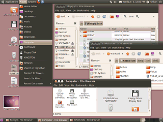
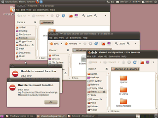
Ubuntu 10.04 starts off with an empty desktop, but you can add files and folder directly on the desktop. Removable drives and network shares in use appear both on the desktop and in the "Places" menu in the top panel. All drives, including local drives can be viewed from the "Computer" item in the menu. File windows can be displayed as Icons, List (details), or Compact (smaller list of icons) Icons can also be made larger or smaller using the zoom buttons. An "Extra" pane can be displayed in a window for source/destination browsing. The side pane listing places is optional. Toolbar, location bar, and status bar are also optional. The file browser can also display multiple folders in the same window using tabs. The file browser breaks the current location down in to a series of clickable buttons. Normally this works great, but sometimes I needed to type in a location manually. I kept having to search for the option to let me do that, which is located under the "Go" menu. In a previous version there used to be a button next to the location for that. Annoyingly, the print screen button fails to operate when a menu is displayed. To get a screen shot of menus I had to run the screen shot application directly. Accessing floppy drives works, although it fails to check to see if the disk has been changed. If you remove or put in a different disk you must select "unmount" or it will keep thinking the original disk is there. Yea, yea, traditional floppy drives don't have any reliable way to notify the OS if a disk is changed or removed. Cry me a river. At least it beats how things were in the 1990s when a Linux user would have to type a truckload of archaic commands after inserting or removing a disk. They didn't care about floppy drives then, they certainly don't care about them now that almost nobody uses them any more.
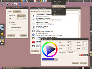
It seems way too easy to delete the important panels. It looks like it is supposed to prevent you from deleting the very last panel on the screen so you have some way to create a new panel (create new panel is not a desktop option), but if the last panel is invisible then what? Try that from a live CD where it dosn't matter: create a new panel that comes out invisible and then delete the two on the screen. |
